Melbourne Pedestrian Behaviour
What is this website about?
This website explores how pedestrian activity across Melbourne has changed since before the COVID-19 pandemic, using data from The City of Melbourne Pedestrian Counting System. This system forms a network of sensors across the inner city, recording hourly pedestrian volumes at each location. By comparing pre-pandemic data from 2019 with more recent observations in 2025 this project aims to quantify how pedestrian movement has changed over these years.
To analyse these changes, we used statistical models which account for both the widespread effects across the city, and location specific deviations from these trends. This approach recognises that different locations will have been impacted in different ways. In particular, we expect the increase in working from home to have disproportionately reduced the pedestrian traffic in areas with a concentration of offices.
Because this analysis is based on observational data, many confounding factors are present and we cannot establish causality. However, it still offers valuable insight into how our city has changed across this pivotal time in recent history.
This page is a hobby project, and part of my ongoing learning in statistics. I have aimed to present an honest and balanced interpretation of my findings. If you notice any issues, please feel free to submit an issue on GitHub :)
Data on pedestrian counts is obtained from The City of Melbourne OpenData Pedestrian Counting System.
General Analysis of Pedestrian Traffic
Melbourne is less busy than in 2019
Across the network, pedestrian counts have decreased significantly with Fridays in 2025 experiencing a 34.9% reduction from their 2019 levels (Figure 1.4) indicating a general reduction in activity across the city.
These Changes Were Not Felt Evenly Across the City
Figure 1.2 maps the change in pedestrian activity from 2019 to 2025. While most locations experienced declines, the magnitude of these changes varied significantly. We can see some of the largest decreases were felt south of Londsdale St with activity at Burke St Mall decreasing by 66.9%. However, the northern CBD around Melbourne Central and RMIT were relatively less impacted with some locations seeing increases in activity.
This may be partially attributed to working at home which caused locations with many offices to experience less pedestrian traffic. We further investigate this effect as we discuss how different days of the week have been affected.
It is important to note that sensors do not provide even coverage of the entire CBD (notably between Queen and King Street) and so we cannot draw conclusions for areas without sensor coverage.


Weekdays Were the Most Impacted
Changes in pedestrian activity between 2019 and 2025 vary substantially across the week. Weekdays experienced the largest decline with Mondays showing the steepest reduction with 2025 activity showing a 37.7% decrease. Midweek days were relatively more resilient, with Wednesday and Thursday declining by 31.6% and 32.5% respectively (Figure 1.4). This pattern may reflect workers opting to work from home on days at the start or end of the week.
In contrast, weekend activity decreased to a lesser extent (Figure 1.5), with Saturday counts decreasing by only 19.0% from 2019 to 2025 (Figure 1.4). This further supports the hypothesis that working from home is a major driver for the overall drop in pedestrian traffic.


Location Specific Pedestrian Traffic
Change in Pedestrian Traffic from 2019 to 2025
This interactive map illustrates the locations of pedestrian sensors across Melbourne. At each location, the height of each column corresponds to the change in daily pedestrians counted from 2019 to 2025.
Drag the map to rotate
Double tap to enable/disable map rotation
Select a sensor on the map to view details
Methodology
Introduction
Linear Mixed Models
Linear mixed models (LMMs) extend simple linear models by allowing for both fixed and random effects. This is important when observations are dependent. In our case, multiple readings from the same sensor are inherently correlated which violates the independence assumption of ordinary linear models.
By including random effects, LMMs allow for sensor-to-sensor deviation while still being able to analyse the population level trends.
Formally, we model this as
\[\boldsymbol y = X \bbeta + Z\b + \boldsymbol \varepsilon\]
where
- $\bbeta$ is a vector of fixed effects,
- $X$ and $Z$ are the design matrices of the fixed and random effects respectively,
- $\b$ is a vector of random effects with multivariate normal distribution with covariance matrix $G$, $\b \sim \norm{\boldsymbol 0}{G}$,
- $\boldsymbol \varepsilon$ is a vector of residual errors assumed to be multivariate normally distributed $\norm{\boldsymbol 0} {\sigma^2 I}$ capturing variation that is not explained by the model.
This formulation properly accounts for the heterogeneity of pedestrian activity across many locations.
Lognormally Distributed Data
The lognormal distribution is often a natural model for non-negative data that arises from multiplicative processes.
In our dataset, a histogram of mean daily counts at each sensor (Figure 3.1, Plot 1) reveals a heavily positive skewed and non-normal distribution. This violates the assumption of our mixed linear model that $\b \sim \norm{\boldsymbol 0}{G}$, encouraging a transformation.
Applying a log transformation to these daily counts (Figure 3.1, Plot 2) substantially improves, symmetry producing a plot that is closer to normal. This is formally described as
\[\log\boldsymbol y = X\bbeta\ + Z\b + \boldsymbol \varepsilon. \]
Despite this improvement, there is a significant heavy left tail, highlighted in the Q-Q plot (Figure 3.2), indicating that the log-transformed data is not perfectly normal. This suggests that although the log transformation has improved our model, some caution must be taken when applying methods that rely on the normality assumption.
One possible improvement to this study would be to apply a general mixed linear model with a better fitting distribution such as a negative binomial.
For log transformed data it is important to be careful when calculating statistics about the original distribution. One pervasive case in this investigation is Jensen’s Inequality $e^{E[X]} \neq E[e^X]$. Below are two examples of the convexivity corrections that arrise from trying to find the expectation of pedestrian counts $y_{ij}$ for some sensor $i$ and observation $j$.
\[\log y_{ij} = \boldsymbol{x}^T_j\bbeta + \boldsymbol{z}^T_j\b_i + \varepsilon_{ij}\] \[y_{ij} = \exp\{\boldsymbol{x}^T_j\bbeta + \boldsymbol{z}^T_j\b_i + \varepsilon_{ij} \}\] We can take the expectation with respect to a single sensor $i$ with effects $\b_i$, \[E[y_j|\b_i] = E[\exp\{\boldsymbol{x}^T_j\bbeta + \boldsymbol{z}^T_j\b_i + \varepsilon_{ij} \} | \b_i]\] Since both $\bbeta$ and $\b_i$ are fixed they can be taken out of the expectation. Moreover since the residual is independent of the random effects, the conditional can be dropped. \[= \exp\{\boldsymbol{x}^T_j\bbeta + \boldsymbol{z}^T_j\b_i \} \cdot E[e^{\varepsilon_{ij}}]\] The residual part may be recognised as the moment generating function of a normal random variable, \[= \exp\{\boldsymbol{x}^T_j\bbeta + \boldsymbol{z}^T_j\b_i \} \cdot e^{\frac {\sigma^2} {2}}\] By a similar analysis for the marginal expectation we find, using the fact that the sum of independent normals is also normal, that $E[y_{ij}] = \exp\{\boldsymbol{x}^T_j\bbeta\} \cdot \exp\{\frac 1 2(\boldsymbol{z}^T_jG\boldsymbol{z}_j + \sigma^2)\}$ where we also have that extra exponentiated factor.
Model Selection
First Model - Common day structure, sensor‑specific year response
This model assumes all sensors share a common weekly pattern, while each sensor has its own response to year. Key points:
- Day‑of‑week differences remain consistent between 2019 and 2025 (parralel lines within groups).
- Sensors can be differently affected by the change from 2019 to 2025 (each group has a unique slope).
We can model this as:
\[\log(y_{i,t}) = \beta_0 + \beta_1 \text{Year}_t + \sum_{D \in \text{days}\setminus \text{Friday}} {(\beta_d\, \mathbb{1}_{t \in D})} + b_{0,i} + b_{1,i}\,\text{Year}_t + \varepsilon_{i,t}\]
Here \(y_{i,t}\) is the daily count at sensor \(i\) on day \(t\), and \(\text{Year}_t\) is an indicator for the year 2025 (\(0\) for 2019, \(1\) for 2025).
Fixed effects
- \(\beta_0\): Mean log daily count on Friday in 2019.
- \(\beta_1\): Population‑average log difference between 2019 and 2025.
- \(\beta_d\): Effect of day \(d\) relative to Friday.
Random effects
- \(b_{0,i}\): Sensor‑specific deviation from \(\beta_0\).
- \(b_{1,i}\): Sensor‑specific deviation in the year effect \(\beta_1\).
- \(\varepsilon_{i,t}\): Random error, \(\varepsilon_{i,t} \sim N(0, \sigma^2)\).


Second Model - Day Specific Year Effects
In this model we relax the assumption that the weekly structure is constant across 2019 and 2025. We introduce a fixed interaction effect (highlighted below in blue) which models how different days have been affected over time.
This is motivated by real-world understanding: the COVID-19 pandemic introduced working-from-home measures that have remained in place, suggesting weekdays might be more affected from 2019 to 2025.
Importantly, in this model, the interaction effect is still constant across sensors (size of deviation in slope for each day is shared across groups), meaning all areas of Melbourne are modeled as equally affected. This assumption is relaxed in model 3 to allow for location-specific variability.
\[\log(y_{i,t}) = \beta_0 + \beta_1 \text{Year}_t + \sum_{D \in \text{days} \setminus \text{Friday}} {(\beta_d \mathbb 1_{t \in D})} + {\color{#0d6efd}\sum_{D \in \text{days} \setminus \text{Friday}} {(\beta_{d \times Year} (\text{Year} \cdot \mathbb 1_{t \in D}))}} + b_{0,i} + b_{1,i} \text{Year}_t + \varepsilon_{i,t}\]
Final Model - Sensor‑specific Weekend Effects
This final model further relaxes the structure of the random effects, allowing pedestrian count patterns to vary by location while retaining a common day-of-week structure across the population.
To improve model stability and avoid overfitting, we introduce a binary random effect distinguishing weekends from weekdays via the indicator $\text{Weekend}_t$. Rather than allowing fully day-specific random effects, this specification captures location-specific deviations in weekend behaviour while maintaining reliable convergence.
In particular, this model allows us to investigate how changes in behaviour from 2019 and 2025 (such as increased working from home) uniquely affect weekend and weekday pedestrian activity across locations.
\[\log(y_{i,t}) = \beta_0 + \beta_1 \text{Year}_t + \sum_{D \in \text{days}\setminus \text{Friday}} (\beta_d\, \mathbb{1}_{t \in D}) + \sum_{D \in \text{days}\setminus \text{Friday}} (\beta_{d \times \text{Year}} (\text{Year}_t \cdot \mathbb{1}_{t \in D})) \\ + b_{0,i} + b_{1,i}\,\text{Year}_t + {\color{#0d6efd}b_{2,i}\,\text{Weekend}_t} + {\color{#0d6efd}b_{3,i}(\text{Year}_t \cdot \text{Weekend}_t)} + \varepsilon_{i,t}\]

Evaluating Models
After fitting each of these models with maximum likelihood, I evaluated their fit by comparing their Akaike information criterion (AIC).
AIC of models (lower is better)
| Model | AIC |
|---|---|
| Model 1: Common day structure, sensor-specific year | 55187.80 |
| Model 2: Day-specific year effects | 55024.57 |
| Model 3: Sensor-specific weekend effects | 47201.61 |
| Alternative: Day-specific random effects | 47638.51 |
As can be seen by the significant improvement from model 2 to 3, heterogeneity in how locations responded to Covid on Weekdays vs Weekends is pertinent to our data.
After performing this validation, the model was refit using restricted maximum likelihood
(REML) for a less biased fit.
The results of this are shown in Figure 3.6.
Mixed Linear Model Regression Results
====================================================================================================
Model:                           MixedLM               Dependent Variable:               daily_count
No. Observations:                34178                 Method:                           ML
No. Groups:                      49                    Scale:                            0.2264
Min. group size:                 442                   Log-Likelihood:                   -23575.8062
Max. group size:                 730                   Converged:                        Yes
Mean group size:                 697.5
----------------------------------------------------------------------------------------------------
                                                         Coef.  Std.Err.    z    P>|z| [0.025 0.975]
----------------------------------------------------------------------------------------------------
Intercept                                                 9.289    0.123  75.369 0.000  9.047  9.530
day[T.Monday]                                            -0.175    0.014 -12.652 0.000 -0.202 -0.148
day[T.Saturday]                                          -0.309    0.082  -3.758 0.000 -0.470 -0.148
day[T.Sunday]                                            -0.482    0.082  -5.861 0.000 -0.643 -0.321
day[T.Thursday]                                          -0.042    0.014  -3.063 0.002 -0.070 -0.015
day[T.Tuesday]                                           -0.091    0.014  -6.626 0.000 -0.118 -0.064
day[T.Wednesday]                                         -0.055    0.014  -3.973 0.000 -0.082 -0.028
year[T.2025]                                             -0.360    0.066  -5.413 0.000 -0.490 -0.230
day[T.Monday]:year[T.2025]                               -0.045    0.019  -2.330 0.020 -0.083 -0.007
day[T.Saturday]:year[T.2025]                              0.173    0.029   6.039 0.000  0.117  0.229
day[T.Sunday]:year[T.2025]                                0.132    0.029   4.598 0.000  0.076  0.188
day[T.Thursday]:year[T.2025]                              0.036    0.019   1.865 0.062 -0.002  0.074
day[T.Tuesday]:year[T.2025]                              -0.004    0.019  -0.229 0.819 -0.042  0.033
day[T.Wednesday]:year[T.2025]                             0.048    0.019   2.502 0.012  0.010  0.086
Group Var                                                 0.739    0.314
Group x is_weekend[T.True] Cov                           -0.016    0.147
is_weekend[T.True] Var                                    0.322    0.138
Group x year[T.2025] Cov                                 -0.172    0.129
is_weekend[T.True] x year[T.2025] Cov                     0.065    0.081
year[T.2025] Var                                          0.207    0.089
Group x is_weekend[T.True]:year[T.2025] Cov               0.025    0.044
is_weekend[T.True] x is_weekend[T.True]:year[T.2025] Cov -0.039    0.031
year[T.2025] x is_weekend[T.True]:year[T.2025] Cov       -0.018    0.024
is_weekend[T.True]:year[T.2025] Var                       0.022    0.012
====================================================================================================
Model Diagnostics
First Model - Common day structure, Sensor Specific Year Response
This model faces some non-trivial deviations from our assumptions, which we investigate using diagnostic plots.
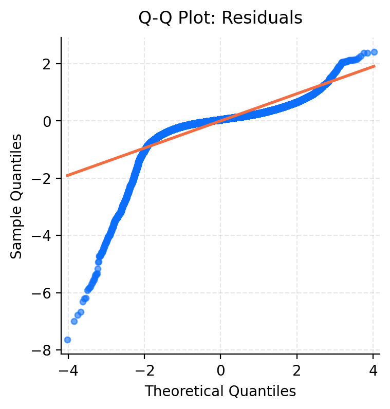
Heavy Left-Tail
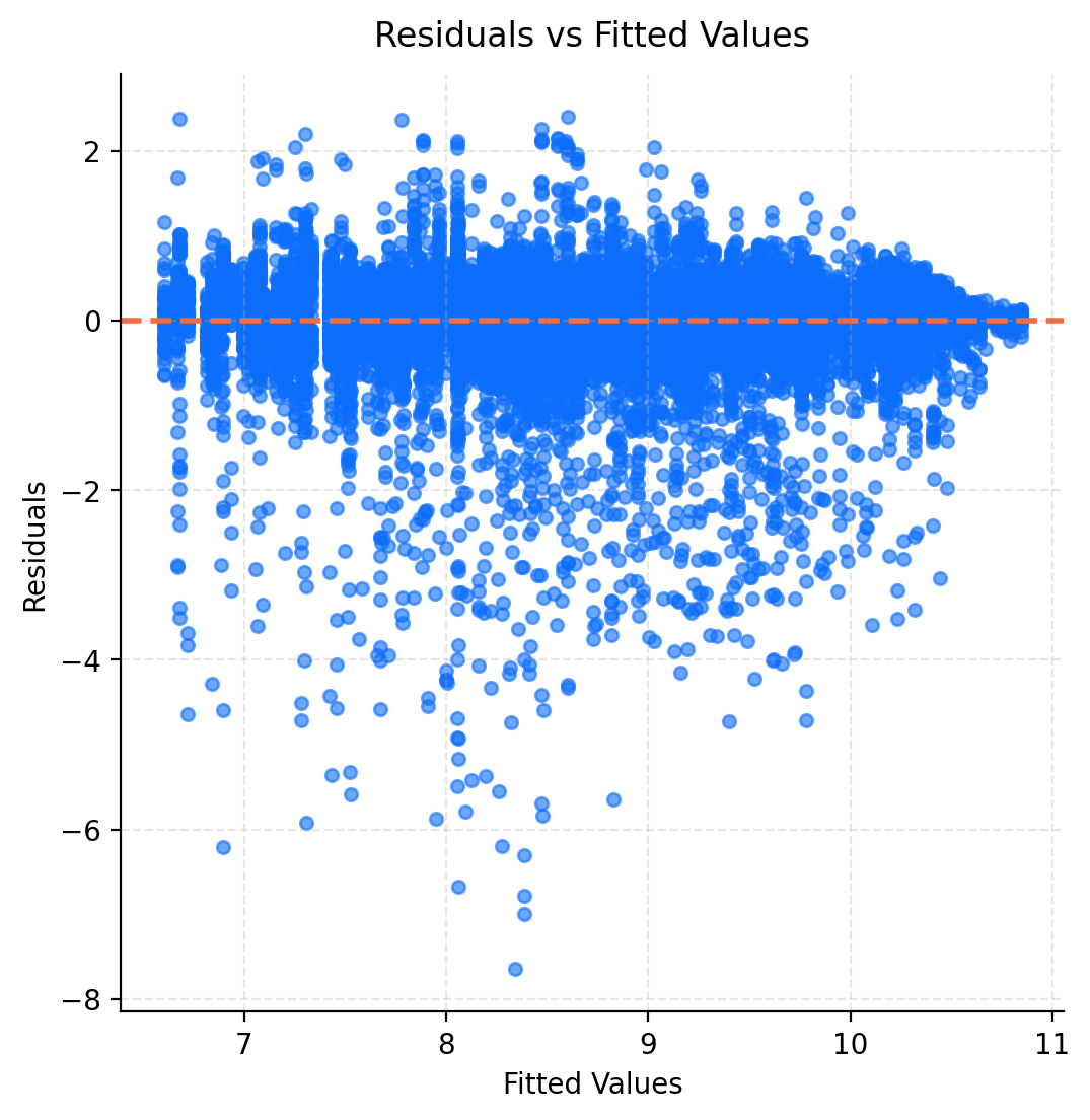
The Q-Q plot of residuals (Figure 3.7) indicates a heavy left-tailed in our data. The sharp dip on the left side of the plot indicates that the model overestimates the pedestrian activity of the lowest readings. This behaviour is also visible in the plot of residuals against fitted values (Figure 3.8) where we see more negative than positive residuals. Together these diagnostics indicate that the model struggles to represent periods of low pedestrian activity.
Heteroskedasticity
Figure 3.8 additionally reveals a fanning effect at the higher end of fitted values, indicating heteroskedasticity. This pattern likely arises from the log transformation where the variance in pedestrian counts does not increase at the same rate as the mean.
Random Effects
In contrast the Q-Q plots of random effects (Figure 3.9) show substantially better agreement with the normal assumption. Despite some deviation, the random effects appear to be roughly normal. This indicates that model error predominantly arises from observation level structure rather than specification of random effects.
Overall, the diagnostic plots reveal some departure from the LMM assumptions, particularly at low pedestrian counts. These limitations reflect challenges with modelling log-transformed count data and could be further addressed by a general linear mixed model.
Despite these issues, the model is sufficient for the purposes of this investigation to adequately capture the dominant patterns in the data at both a location specific and Melbourne wide level.